

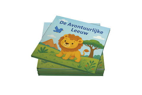
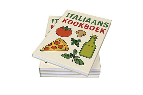
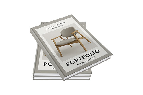
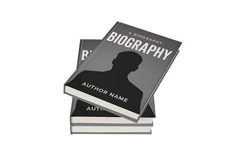


A good book stands out even before anyone has read a single letter. The design determines the first impression and influences whether someone picks up the book, flips through the pages, and continues reading. Whether you are creating a family book, a short story collection, or an anniversary book: professional book design elevates your project to a higher level. In this blog, we provide practical tips for a beautiful layout, suitable fonts, and a powerful cover.
Why is book design so important?
- The content of your book is, of course, the most important thing. But if the design is messy or unclear, that content will not be properly showcased. A professional design ensures:
- A pleasant reading experience
- A well-groomed and credible appearance
- Better balance between text, white space, and images
- Greater reader engagement
In short: form and content reinforce each other.
Ensure a clear layout
Good layout begins with calm and clarity. Note:
- Generous margins: Give the text space on all sides so that it reads comfortably.
- Correct line spacing: Too close together looks cluttered, too far apart feels empty.
- Paragraph formatting: Use blank lines or indentations to structure your text.
- Headings and subheadings: These provide an overview and make the book scannable.
Preferably work with a fixed template: repetition in layout creates a professional whole.
Choose the right font
Fonts determine both the atmosphere and the readability of your book. A few tips:
- Use a classic serif font (such as Garamond or Palatino) for longer pieces of text. This is easier to read in print.
- Feel free to use a modern or contrasting style for headings and titles.
- Combine a maximum of two different fonts throughout your entire book – more than that quickly makes it look cluttered.
Also pay attention to the size: generally, 9 or 10 pt is ideal for reading text.
Pay attention to the cover
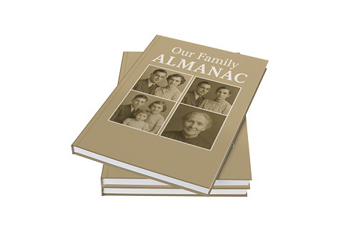
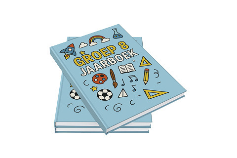
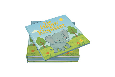
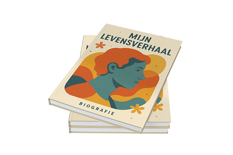
- The cover is the first thing people see and determines whether they pick up the book. A successful cover design:
- Fits the subject and atmosphere of your book
- Is readable, even on smaller formats
- Use a powerful image or typographic solution
- Contains a clear title, subtitle, and optionally an author’s name or year
Consider having a designer take a look or use a professional template as a basis.
Don’t forget the back and back either
In addition to the front cover, the spine is also important, especially if the book will be placed on a shelf. Ensure that the title and author are clearly legible. On the back, you can include a short description, possibly with a photo, logo, or a personal note.
Have a proof made
A design always looks different on screen than in print. By means of a proof copy By requesting this, you can assess whether colors, spacing, and font sizes are correct and whether the cover fits well. Small adjustments currently make the difference between ‘fine’ and ‘professional’.
Finally
Professional book design doesn’t require expensive software or a graphic design background – just attention, a clear overview, and smart choices. And if you can’t quite figure it out yourself? Bookadew is happy to help you on your way with practical tips or support with the design.
Ready to give your book the look it deserves? Then choose a professional cover design; it is easy to order via our calculator.